Responsive Website Design
Successful websites are designed with your visitors’ needs in mind. It’s important to provide useful content that can be browsed with a simple and intuitive navigation. To improve leads and purchases, we add elements to our designs that engage viewers and entice them to make specific actions.
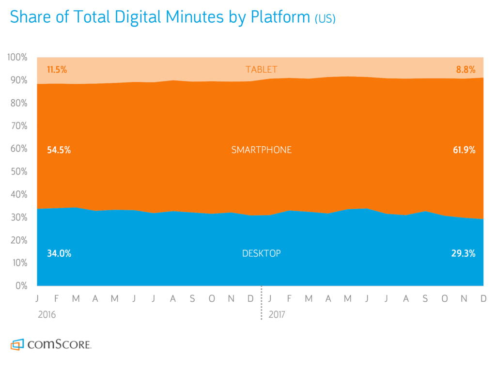
Mobile can’t be ignored.
In 2014 an important tipping point was reached: mobile internet traffic overtook desktop traffic. With smartphones becoming ever more powerful and portable, in 2019, many people now prefer to browse the web from the palm of their hand instead of the confines of a desk, this in turn requires responsive website design.
What does this mean for your business? It’s an absolute necessity to have a website that looks and functions well on mobile devices. Text should be legible without pinching and zooming. Content should be given preference over design elements. Contacting your business via phone or form should only be a click away.
Mobile design isn’t an afterthought for us, and for many types of businesses such as restaurants, stores, and consumer services, it actually comes first. We test websites on tablets and phones as they’re developed to identify issues. Before launching, we do a final round of testing on a variety of devices and operating systems and continue to do so routinely as part of a website maintenance program.